The company developed quite a following this way, but they knew they were only scratching the surface of digital marketing. They wanted to scrap their old ineffective marketing techniques and go all-in with a new website that complimented their social media strategy and allowed them to manage as much as possible on their own.
We created an SEO powerhouse for the company, ensuring their new site would be found by shoppers by catapulting it straight to the top of Google. In return, the website, itself, became a lead generation magnet that, within six months, was attracting 350 new customers every week. We also helped Tuscany develop an email lead list and enhance sales funnels, turning casual website visitors into interested customers, and created a blog for an SEO boost and visitor engagement.
All this was tied together in a beautiful interface that truly represents the brand’s reputation for quality and makes use of their active social media presence (now 20,000 followers strong!) with integrated feeds. Because the website and social media campaigns are a resounding success, the McConnells dropped marketing through traditional channels and are now saving 50-75% on marketing while generating superior results.
350
New Customers
Per Week
450
New Sessions
Per Week
50-75%
Marketing Cost
Reduction

Branding
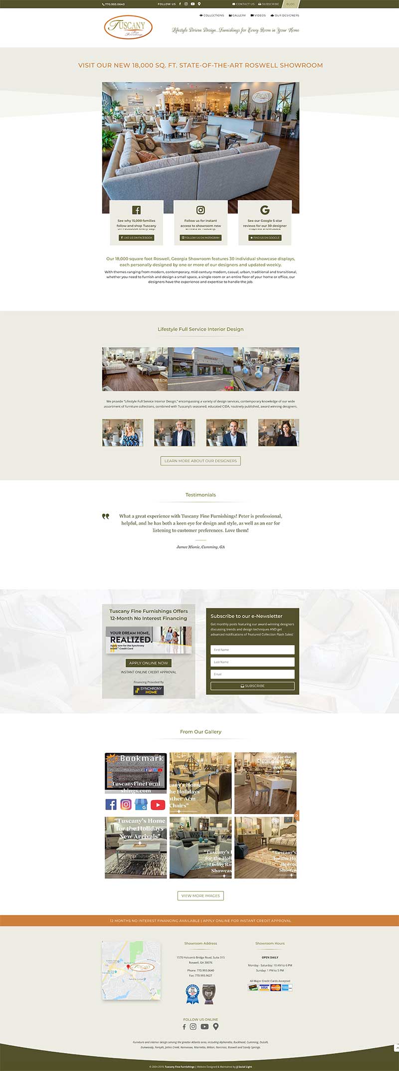
By creating a clean design and carrying over established branding elements, such as logo and color schemes, Tuscany retained its luxury appeal, increased brand recognition, and provided a cohesive experience across its various marketing channels.
Layout
We integrated an uncluttered and minimalistic menu, giving visitors a clear concise overview of pages, and popped some of the most important details, such as contact information, at the very top, ultimately creating an interface that keeps visitors on the site longer and exploring more pages.
Optimization
By optimizing the site’s content and tags for targeted keywords we knew potential shoppers would use, Tuscany’s website began attracting interested buyers organically immediately at launch.
Indexation
Because Google and other search engines crawl and index sites better when certain elements, such as sitemaps are present, we addressed these concerns too. This ensured thorough and proper indexation of the site, so more pages appear in search results.
Webmaster Best Practices
Even though people don’t see things like streamlined code and quality hosting, these things have an impact on how the site displays and how fast it loads. Because of this, search engines examine these issues when deciding on rank too. We integrated webmaster best practices throughout the build and provide Tuscany with top-notch hosting, improving the user experience and boosting rank.

Develop Sales Funnels
Mailing List
Mailing lists are a great way to build relationships and convert visitors into customers, but Tuscany didn’t have a way to generate a targeted list. We created an easy way to subscribe to their newsletter directly from the top menu of any page and option again below the fold, encouraging more people to opt in and receive marketing messages.
Online Financing
Eliminating barriers that prevent potential customers from taking action pulls people through the funnel faster. We crafted bold CTAs that highlight financing—a powerful conversion tool—and provided customers with an online credit application that offers instant approval, increasing shopper buy-in.
Appointment Request Form
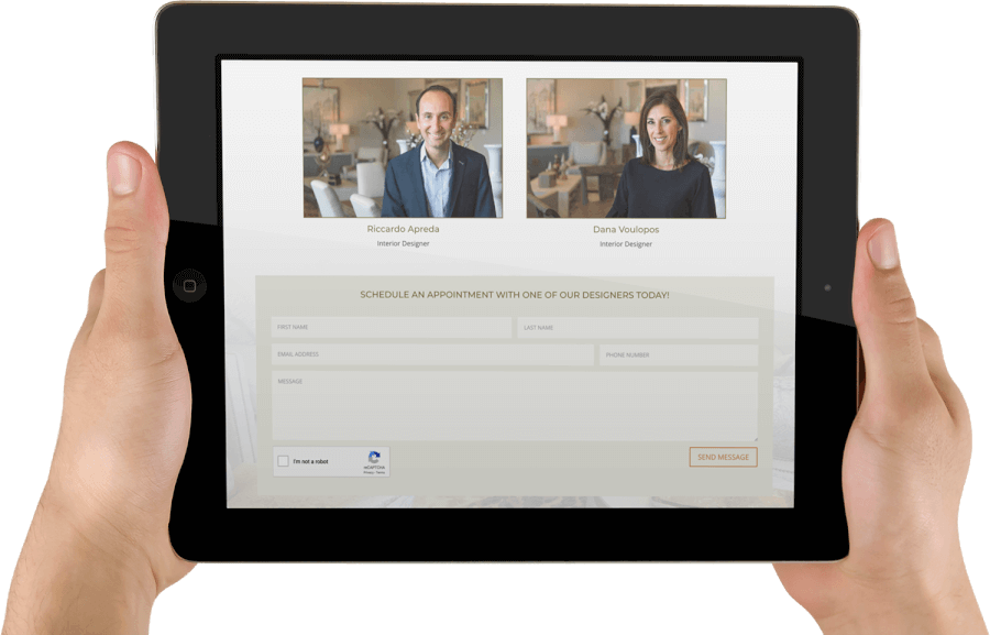
Whereas newsletters are a great way to cultivate strong relationships, some people are ready to take action right away. We devised an appointment request form that benefits visitors by connecting them with a service they want and helps the business by delivering hot leads.

Blog
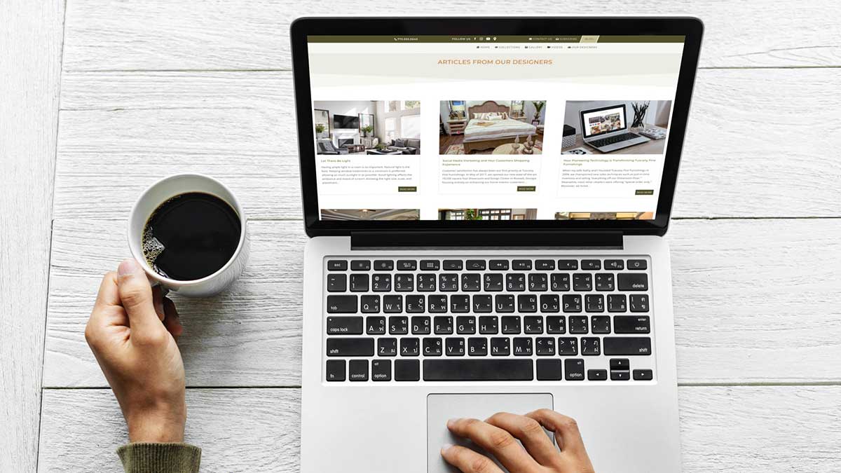
We included a blog section that makes it easy for the client to push out timely and useful information to prospective customers and build trust as well as relationships, plus offers a vehicle to beef up SEO organically with keywords.
Social Network Buttons
Tuscany already knew that being active on social media allows them to connect with customers on a regular basis, generating loyalty and allowing them to reach a wider audience. We integrated links to their primary channels at the top of each page, inviting visitors to connect with them on social media in just one click. We also leveraged prominent CTAs below the fold that give reasons to follow and develop trust, ultimately increasing customer action.

Automated Gallery
The Tuscany team really loves DIY and wanted to handle as much of the site’s maintenance as possible. Because they were already rocking their Instagram account with professional photos of their offerings, we created a specialized feed that automatically pulls images from their Instagram account and displays them directly on their website’s Gallery page, which visitors can access with one click. The McConnells can now keep their site Gallery fresh on their own without having to take any additional steps.
Automated Video Posting
YouTube has been working really well for Tuscany too, and they regularly post professional footage of their showroom. We placed a prominent “Videos” link in the header, right beside the “Gallery” link, and developed a specialized feed that automatically retrieves their YouTube content and displays it on their Videos page. This creates even more engagement on their site, maximizes the value of their footage, and lets them cash in on their work without doing anything new.

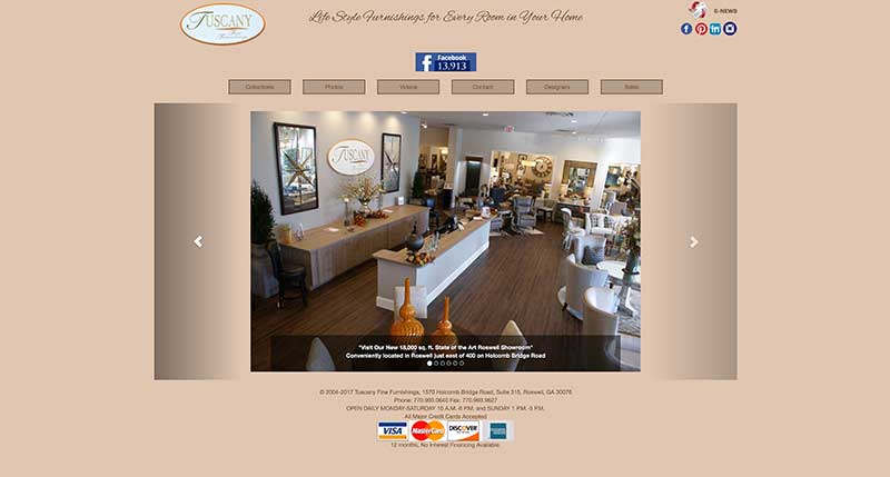
Old Homepage Design
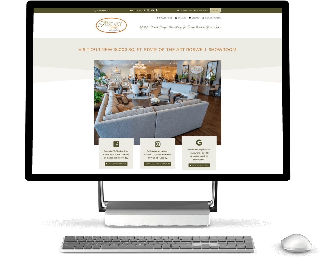
New Homepage Design
Get a Customized Plan for Your Business Website
Each organization we serve has unique challenges, opportunities, and objectives, so the solutions we provide and results will be different each time. You can get a feel for what we offer by exploring the various case studies on our site, but it’s better if you contact us directly, so we can start a discussion about which solutions are right for you.

