
For ages professional offices and workspaces have invested quite heavily on improving the aesthetics of their reception area. Businesses want new customers to see the best face of the organization when they first walk in.
Even if the rest of their corporate office is an eyesore, businesses go out on a limb to ensure the perfect reception area, congenial to their client’s liking.
Similarly, when new customers visit your website, the very first thing they see is your home page. The home page is now your digital reception area. It is your first point of contact with new customers. And, perhaps your only chance of converting new leads.
The way you set your home page up can either make or break conversion rates for you. It can either invite new customers in with hues of appropriate colors and content, or it can scare them away with a sluggish advert of what they can expect from you down the line.
We understand just how much time and effort you have put to improve your SEO rankings. The traffic you’ve achieved on your website is definitely the end result of sleepless nights and hours of keyword research.
But, all that effort might just go to waste if you turn a blind eye to your home page. If you see a boost in website traffic, without any changes in conversion, it is time for you to sit back and analyze your home page.
Where to Start?
Regardless of the business or industry you operate in, paying attention to the design of your website’s home page almost always pays dividend. You have so much to offer through your website, and it can be overwhelming for you to determine what to show to visitors first.
The invariable perks of the home page can tempt business owners into including as much information as they possibly can, but that isn’t the right way to go about the process.
Since we have helped tons of businesses revamp their home page around, we will share some of the secrets of the trade in this article. Follow these secrets and the top elements of the home page to turn your conversion rate around.
It is time you turned your home page into a conversion machine.
Keep It Simple
Why add a plethora of colors, content and pictures to your home page when you can easily keep it simple and enjoy better conversion? Websites with simpler designs and less clutter are known to have higher conversion ratings.
As we mentioned earlier, some websites try their best to cram as much information and content into the small space available on their homepages. To understand their perspective, businesses want to show off their products, awards, services, affiliations, contact information and every other imaginable thing on their home page.
If the description above fits your home page then simplifying your current design should be the first thing on your mind.
It is fine to tell customers all about your brand, your story and your achievements on your website, but all this information shouldn’t be crammed on your homepage.
Take a look at this home page design by Mint.
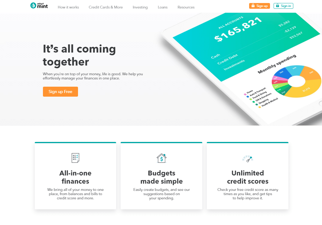
Do you see just how effective it is for businesses to maintain a simple home page? This home page tells you pretty much everything you need to know about the services offered by Mint, but it doesn’t push any of the information in your face, and the home page surely isn’t crammed.
The menu bar placed at the top of their home page screen comes with only four actionable options. The amount of text is also minimal, which allows viewers to just scan through the entire page and focus on key headlines.
As you focus on the middle of the page, you see a clear emphasis on an orange button. That button is their call to action or their CTA button, encouraging all kinds of visitors to sign up for free. Even if you haven’t heard of Mint before, the design and simplicity make the kind of services you can expect from them obvious.
You can tell they help with:
- Finances
- Budgets
- Bills
- Credit Scores
- Savings
These buzzwords are easily identifiable due to the easy layout.
Now, Mint hasn’t shied away from including relevant information on their website. But, none of it is crowding your line of vision on the home page. In fact, viewers can head on to some of the other pages to catch up on their story and their visions and achievements.
The homepage does have some color, but we adore the tasteful and sparing use of it. Colors aren’t contrasting in nature, and you aren’t lost in the vibrancy.
Now, this doesn’t mean that you should eliminate all forms of color from your home page. There are plenty of other relevant websites where businesses have used multiple color schemes to good effect.
The key aspect lies in finding the right balance of what you offer and the color scheme that correlates with it.
You can compare your current homepage with the example above. Find places where you have compromised on simplicity and try to cut down on the extravagance.
Focus on Speed
They say speed thrills, but kills. Not with website conversion rates though. The slower your website is, the harder it will be for you to ace your conversions.
People are more impatient today than they have ever been. The digital age of today has made us slaves to speed. Consumers today are used to getting content at lightening fast speed. And, if your homepage doesn’t load quickly, your conversion rate will probably suffer.
Interestingly, your page speed has a lot to do with the previous point we mentioned. Simpler websites have faster load times – we told you so.
If you have long blocks of irrelevant text, tons of images, lots of colors, flashing lights, complicated menus and plenty of other unnecessary elements, your website won’t load as quickly as you want it to.
So, the first step to increasing speed is to reduce the clutter from your home page and website in general. But, what if that doesn’t work? What if removing all irrelevant content does not improve load times?
In such instances it is best to reevaluate your hosting services. Buying the cheapest hosting plan might sound financially appealing, but you get what you pay for. If you want more conversions, you will have to loosen your pockets and buy a better hosting plan.
Believe us, the boost in conversion and increase in website traffic will more than just pay back for the extra hosting costs.
Use Quality Images
Whenever you’re forced to decide between quality and quantity for your home page, always go with quality. Images can definitely help you improve your conversion rates.
It is a proven fact that websites without quality images seem boring, plain and casual. With the amount of money you have spent on your digital presence, you wouldn’t want people to have that perception of your brand.
However, this is no excuse for you to go crazy with the images and put as many as you possibly can on your web page.
Just like we have studied in the tips above, too many images can hurt your loading speeds. Also, pages with fewer images happen to convert more.
So, what’s the verdict here? You should add some images to your homepage, but try not to overkill it. Sparingly use some relevant images across the page for better traction and conversion.
Also, your images should look professional in nature. Images that look like you took them with a flip phone in 2006 aren’t going to help your cause.
Even as a novice business owner it is pretty easy to decide the kind of images you should go for. Anything with pixels exploding all over the place should be avoided. Double check all images you add and don’t go for anything other than quality.
You can also use images as a means to leave viewers wanting more. If you have an ecommerce website, you can start by posting images of your 5 best selling products.
However, don’t litter your website with 10 plus images of each product. Instead, post just one image and entice customers into clicking on that one image to see the rest.
Optimize Website for Mobile Users
It is awesome if you have a website that performs well on desktop. But, you won’t be able to convert all your potential leads if your home page isn’t optimized for tablets and smartphones.
More than half of the internet will now be accessing your website through their smartphones or mobile devices. The best you can do for them is a homepage that loads just as quickly as your desktop website does.
Mobile users happen to be even more impatient than desktop users. Heck, even we have to break our paragraphs into smaller sections to keep these impatient users hooked.
So, if you want good conversion rates from all users, it is necessary that you account for mobile devices as well. Optimizing your home page for mobile users is not that hard to manage. With a few WordPress additions and design changes, you will have a seamless homepage that loads perfectly across devices.
Make Your Call to Action Clear
We understand that we have already mentioned your CTA in this article a couple of times. But due to its importance, it is necessary that we discuss it in even greater detail.
Your home page will not convert the leads you generate if your CTA isn’t glaringly obvious for viewers. Even though it is critically obvious, many websites end up neglecting their CTAs.
Almost 70 percent of all websites do not display a call to action button on their home page. This statistic just blows us away. How can you expect your home page to generate conversions if you don’t have a CTA on your home page?
Our reservations don’t just end here. Out of the remaining 30 percent that do include CTAs, less than half have an action button that is visible within 3 seconds of entering the website.
People entering your website aren’t going to spend much time locating your CTA button. Your customers definitely won’t show much eagerness if you aren’t willing to convert a lead.
This brings us back to our initial point of simplicity – yet again. It is easy for customers to locate your CTA if you don’t have excessive clutter on your home page.
Look again at the example home page we posted for Mint. See if you can immediately identify the glaring CTA in orange. Obviously you can!
Your call to action button can include text from any of the options below:
- Subscribe now
- Buy today
- Sign up today
- Join for free
- Click to learn more
- Shop now for discounts
Focus on the CTA and you will be converting more leads sooner than later.
Create a Stellar Headline
Since we’ve looked at the role of images, speed, simplicity, design and CTAs in conversion, how could we miss out on the actual content?
It is no secret that headlines generate interest in people. If the headline(s) on your home page are boring, people most definitely wouldn’t read on. However, if your headline is captivating and mesmerizing, you will surely generate more interest from people.
In short, your headline is the one clear shot you have at communicating your value to customers. Don’t let the opportunity slide by.
Conclusion
Using your homepage to drive conversions is a standard practice in the marketing community today. But unfortunately, most of us fail to capitalize on the opportunities present.
Only 2 percent of all visitors have a realistic chance of converting when they first visit your website. And these conversions are necessary if you want your business to stay afloat.
Thankfully, with the quick fixes we have outlined in this article, you can take your homepage and your business to glory.


0 Comments